PB.
TYPOGRAPHIC POSTERS
TYPOGRAPHIC POSTERS
TYPOGRAPHIC POSTERS
A typographic poster series exploring core design
principles through visual composition.
Each poster represents a fundamental concept
such as form, balance, space, rhythm, grid.
The project focuses on using typography, combining
structured layouts with dynamic arrangements.
A concept landing page for a movie night event, where visual hierarchy
and typography shape the user experience. The design balances expressive
visuals with a clear structure, helping users quickly explore films, navigate
content, and stay engaged.
A typographic poster series exploring core design
principles through visual composition.
Each poster represents a fundamental concept
such as form, balance, space, rhythm, grid.
The project focuses on using typography, combining
structured layouts with dynamic arrangements.
CONCEPT
CONCEPT
CONCEPT
The goal was to create a cohesive series that feels both
experimental and structured, balancing clarity
with visual impact.
The goal was to create a clear and engaging interface that allows
users to quickly explore films and choose a session.
The goal was to create a cohesive series that feels both
experimental and structured, balancing clarity
with visual impact.
VISUAL ORDER
VISUAL ORDER
VISUAL ORDER
2026
2026
2026
VISUAL SYSTEM
VISUAL SYSTEM
VISUAL SYSTEM
COLOR PALETTE
COLOR PALETTE
COLOR PALETTE
#FFFFF
#FFFFF
#FFFFF
#000000
#000000
#000000
TYPOGRAPHY
TYPOGRAPHY
TYPOGRAPHY
Arial
Arial
Arial
Aa
Aa
Aa
Inter
Inter
Inter
Aa
Aa
Aa
GRID
GRID
GRID
A structured grid system was used to organize the composition
and maintain alignment. The layout is divided into vertical columns,
creating a clear framework for placing typographic elements.
Even with distorted and dynamic type, the grid provides balance
and consistency, helping guide the viewer’s eye and preserve visual order.
A structured grid system was used to ensure
consistency, alignment, and readability across
the layout. Spacing and proportions help
create a clear visual hierarchy and balanced
composition.
A structured grid system was used to organize the composition
and maintain alignment. The layout is divided into vertical columns,
creating a clear framework for placing typographic elements.
Even with distorted and dynamic type, the grid provides balance
and consistency, helping guide the viewer’s eye and preserve visual order.
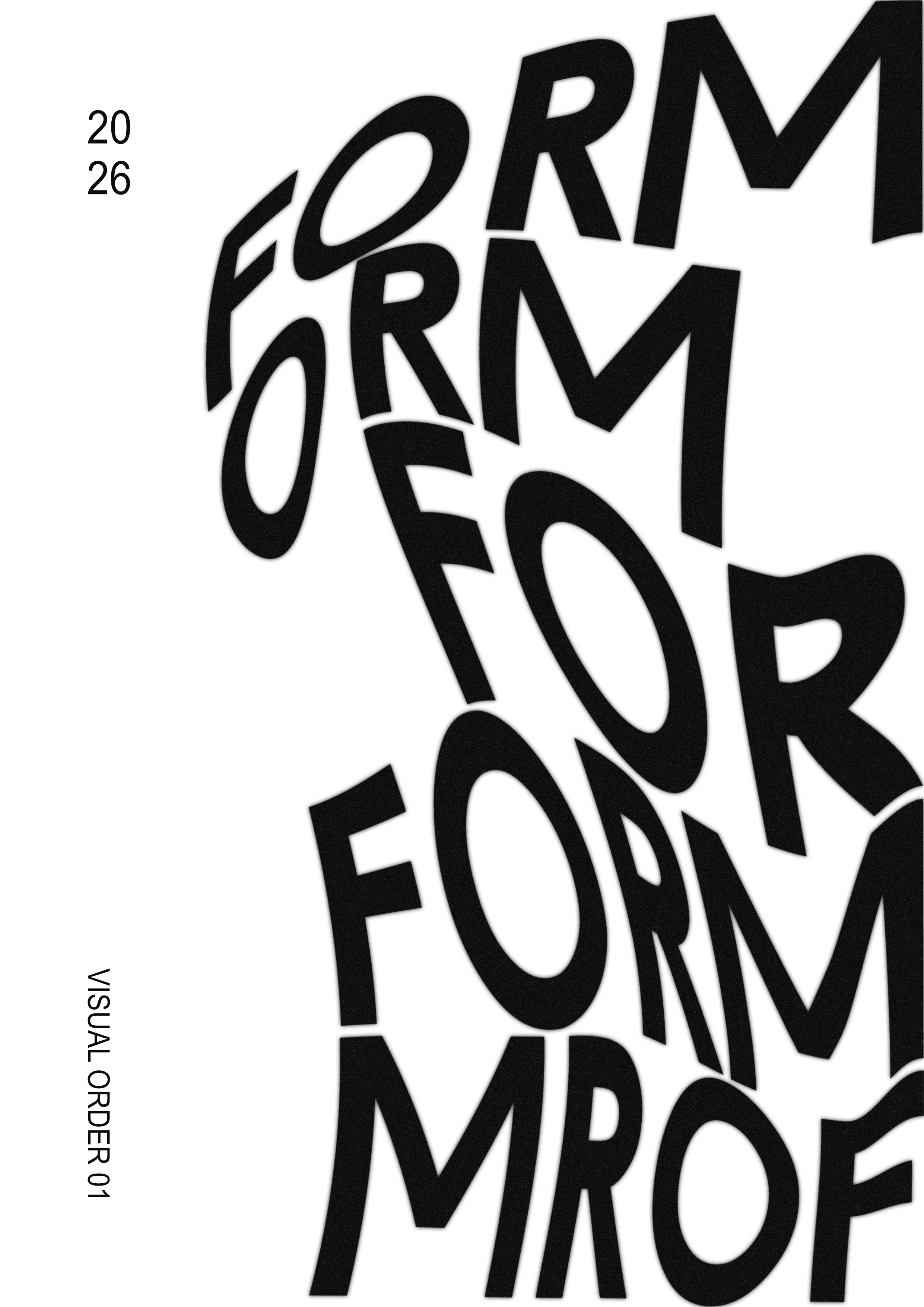
FORM
FORM
FORM
Large-scale typography creates a strong focal point
Bold typography creates a strong visual entry point
Large-scale typography creates a strong focal point
Distortion adds movement and breaks rigid structure
Clear structure improves readability and scanning
Distortion adds movement and breaks rigid structure
Tight composition increases visual density and impact
Tight composition increases visual density and impact
Tight composition increases visual density and impact
LINE
LINE
Strong horizontal headline creates a clear visual anchor
Strong horizontal headline creates a clear visual anchor
Vertical text column and line element guide
the reading direction
Vertical text column and line element guide the reading direction
High contrast and minimal layout enhance clarity
and focus
High contrast and minimal layout enhance clarity and focus
LINE
Strong horizontal headline creates a clear visual anchor
Vertical text column and line element guide
the reading direction
High contrast and minimal layout enhance clarity
and focus

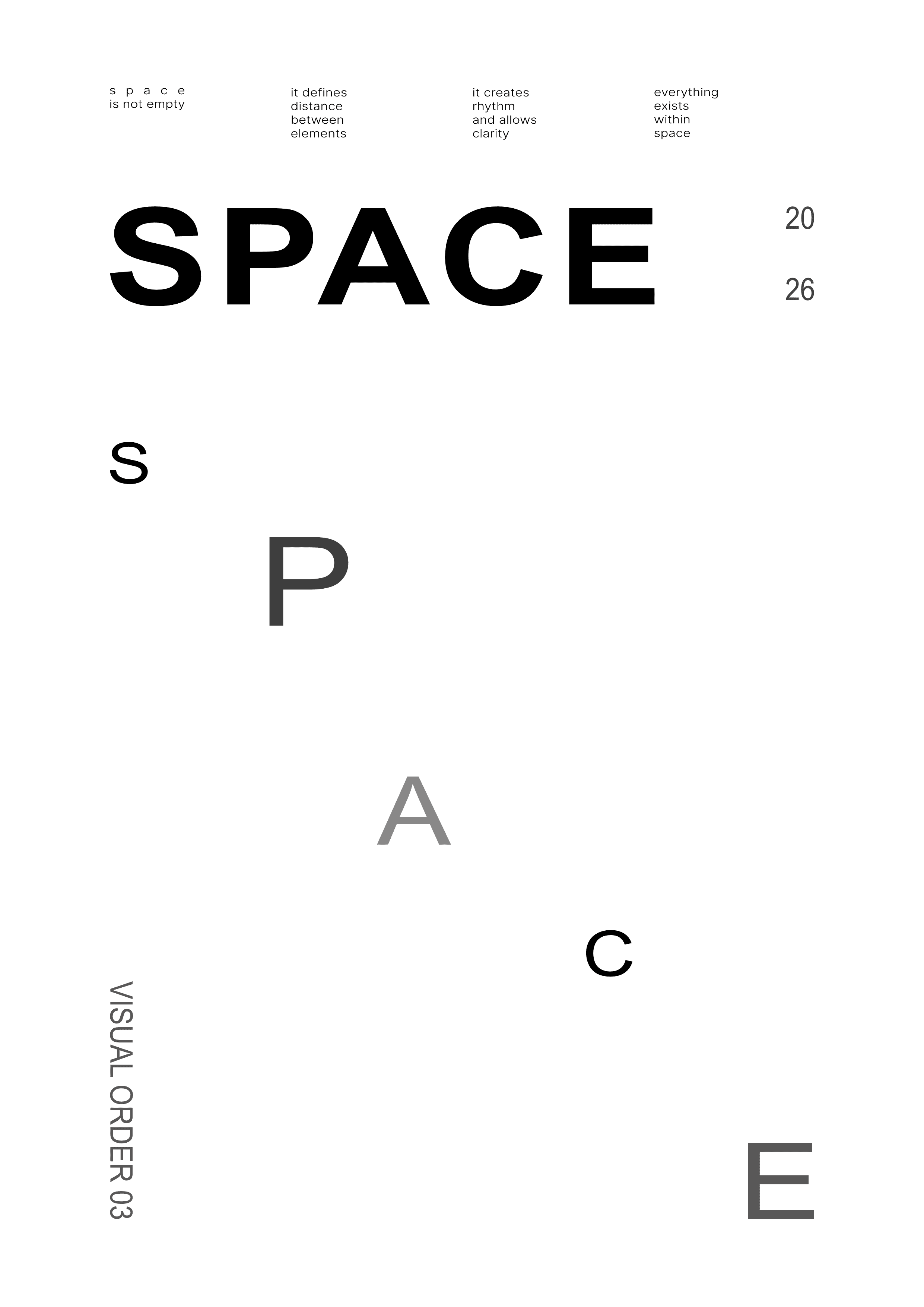
SPACE
SPACE
SPACE
Wide spacing between elements creates a strong sense
of openness
Wide spacing between elements creates a strong sense
of openness
Wide spacing between elements creates a strong sense
of openness
Scattered letters break the word structure
and emphasize negative space
Scattered letters break the word structure and emphasize
negative space
Scattered letters break the word structure
and emphasize negative space
Minimal composition draws attention to placement
and distance
Minimal composition draws attention to placement and distance
Minimal composition draws attention to placement
and distance
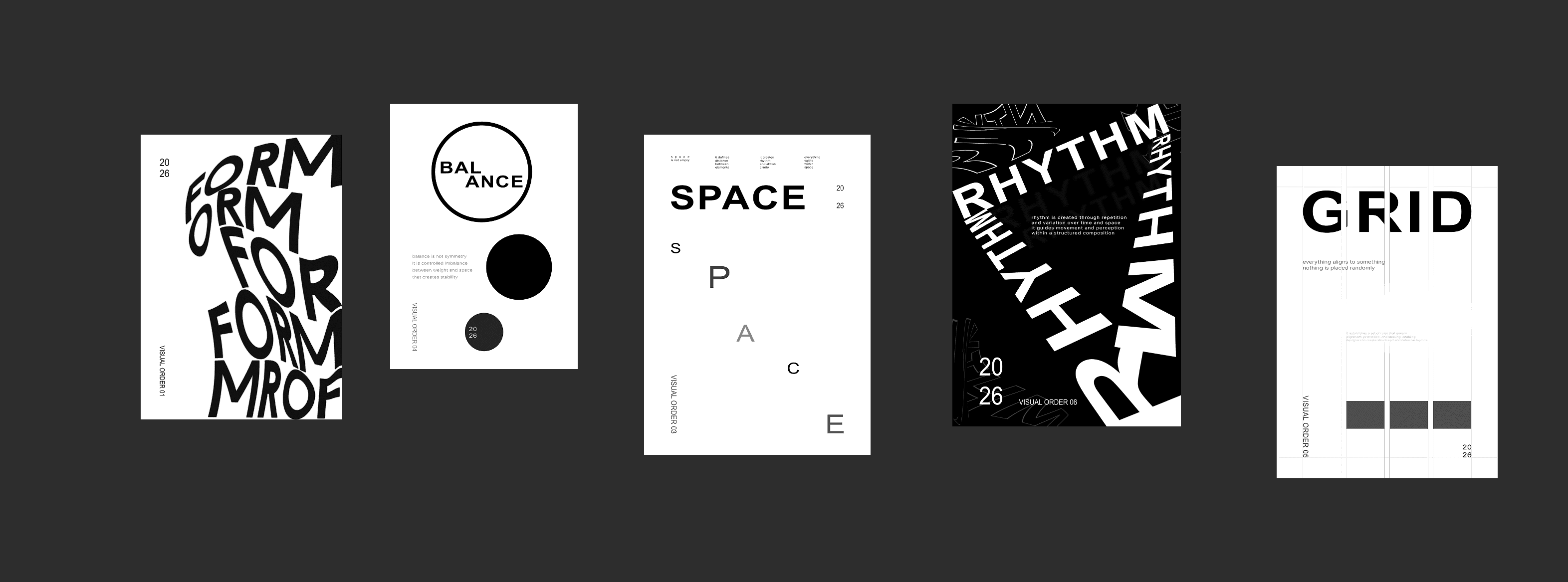
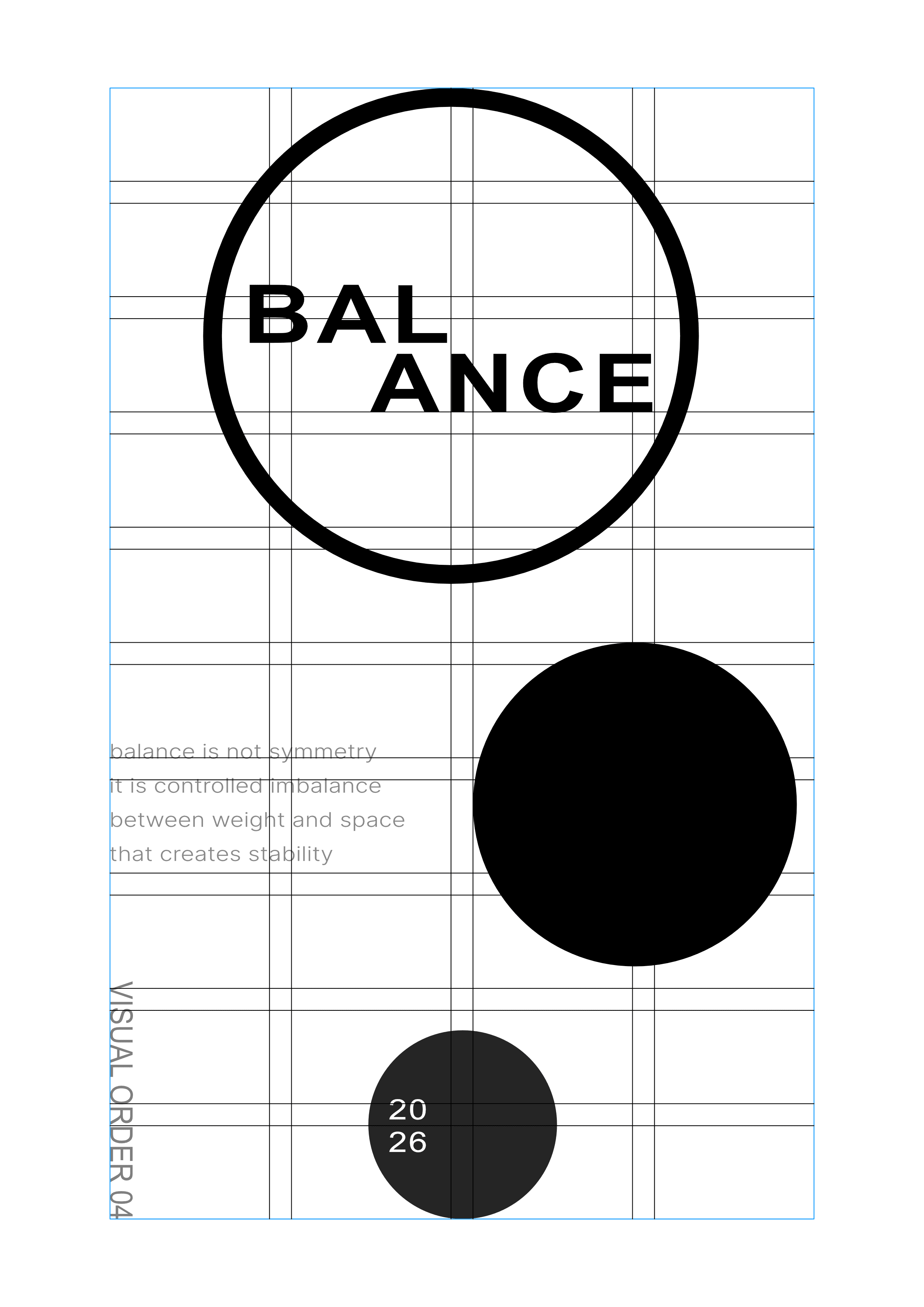
BALANCE
BALANCE
Contrast between large and small shapes creates
visual balance
Visual element supporting the event atmosphere
Offset placement introduces asymmetry
while maintaining stability
Offset placement introduces asymmetry while maintaining stability
Combination of filled and outlined forms
distributes visual weight
Combination of filled and outlined forms
distributes visual weight
BALANCE
Contrast between large and small shapes creates
visual balance
Offset placement introduces asymmetry
while maintaining stability
Combination of filled and outlined forms
distributes visual weight


GRID
GRID
GRID
Grid lines define alignment and structure across the layout
Grid lines define alignment and structure across the layout
Grid lines define alignment and structure across
the layout
All elements are placed within columns, creating consistency
All elements are placed within columns, creating consistency
All elements are placed within columns, creating
consistency
Repeated blocks reinforce modular composition
Repeated blocks reinforce modular composition
Repeated blocks reinforce modular composition
RHYTHM
RHYTHM
Repeated typography creates a continuous visual rhythm
Visual element supporting the event atmosphere
Rotation and scale variation introduce movement
Rotation and scale variation introduce movement
Layering of elements adds depth and complexity
Layering of elements adds depth and complexity
RHYTHM
Repeated typography creates a continuous visual rhythm
Rotation and scale variation introduce movement
Layering of elements adds depth and complexity
